This chart shows SF COVID cases are wildly undercounted
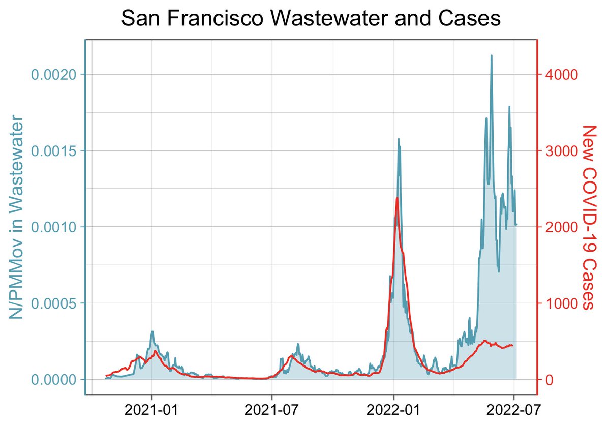

Marlene Wolfe, an assistant professor in environmental health at Emory University, shared a graph on Twitter last week that might explain why it seems like everyone you know has recently gotten COVID-19.
Wolfe’s graph, which compares official case counts in San Francisco with the volume of viral COVID-19 RNA in samples of county wastewater, clearly shows that the number of people with COVID in San Francisco is far higher than official case counts would suggest. In fact, judging by the volume of poop containing the virus now flowing through the county sewers, there are as many or even more people with COVID-19 now than there were at the peak of last winter’s omicron surge.
Last week, the city recorded an average of 406 cases a day. But wastewater data suggests the real number could be much closer to the number of people infected during that January surge, when more than 2,300 people were testing positive for the virus every day on average.
Wolfe cautioned against extrapolating case numbers as she said even the January data when more people were going to clinics for PCR tests isn’t considered “gold standard data,” but she said it’s probably safe to say that you can multiply today’s official case numbers by 5 to get closer to a real number.
Undercounted case numbers aren’t unique to San Francisco, Wolfe said; the situation is similar in other Bay Area counties and across the country.
Wolfe told SFGATE that the wastewater data is a useful way to compare the volume of cases across different time periods, especially since access to testing has varied so widely throughout the pandemic. “At the beginning tests weren’t available, and now we have wide availability of at-home tests,” said Wolfe, an environmental biologist, engineer and epidemiologist with a Ph.D. in environmental health.
Still, she warned that this one graph doesn’t show the full story — especially when it comes to the actual impact on public health.
“The amount of infection we see in the wastewater doesn’t translate directly to the risk in the community,” Wolfe cautioned. Hospitalization and mortality data are also key pieces of the puzzle. In San Francisco, for instance, hospitalizations are on the rise, though they haven’t soared as high as they did in January.
It’s not surprising that, when so many people are being infected, some of them will go to the hospital. BA.5 is the most easily transmissible COVID variant to date; preliminary research suggests it may avoid the first layer of antibodies in the body from vaccination and prior infections, making it more likely you’ll catch the virus if you’re exposed.
However, the body’s other lines of defense still recognize and fight the virus, meaning far fewer people are being hospitalized than during earlier waves, such as the delta surge. Even at the peak of January’s first omicron wave, 286 COVID patients were hospitalized. By comparison, 137 people were hospitalized on July 14, the most up-to-date number available.
It’s important to keep in mind that some patients may be in the hospital due to COVID, while others came in for other reasons, such as surgery, and incidentally tested positive. Dr. Bob Wachter, the chairman of medicine at UCSF, wrote on Twitter last week that the number of people admitted to UCSF hospitals because of COVID, as opposed to being admitted for other reasons and later testing positive, is lower than it was over the winter. The ratio is now about 50/50; in January, two-thirds of COVID-positive patients were there to be treated for COVID complications, Wachter said.

